This page hasn’t been updated in a long time. We have changed our positioning and service offerings. Please get back to the main page to know more about our marketing solutions for professional services firms.
case study
The project
We were tasked to create a trilingual website for a construction company and give their logo a fresh look.
The challenge
We had to learn about the company, their values; look into the problem they are trying to solve; get to know who the core customers are; figure out how to position the service; align the offer, design and messaging with the goal and target customers' expectations in mind.
Continue reading to learn
what we did to help solve these problems.
About
During the discovery session in our strategy workshop we found out Baltpanels has been in the construction industry for over 25 years. The company has grown from doing small occassional jobs to complex projects like multi-story apartment buildings, offices, industrial spaces, etc. Their success has been folstered by uncompromised attention to detail, responsibility, strive for improvement and beauty.
The problem
Trust, quality, responsibility, competence, reliability - these are the most common issues clients have to contend with when dealing with contractors. Baltpanels knows this too well and has always been committed to providing a single source responsibility construction services. Their standards are high and so is the reputation.
Customers
The most challenging, captivating and rewarding projects were always in private sector for the enterpise: apartment renovations, residential house construction, swimming pools, saunas. Company's core customers have always been referred by previous clients. These are the people who are looking for a partner they could trust, the co-creator of the space their family would live in - a safe, well designed, thought-through, rejuvenating environment without hidden flaws, cracks, leaks, 'cut corners' or 'loose ends'. Target clients are well-off people in their late 30's to 50's, usually families with several children and pets. They have enough of their own responsibilities and worries, so they are looking for a peace of mind and reliability when it comes to such a daunting endeavor as construction and renovation.
Positioning
Baltpanels provides reliable construction and renovation services to savvy clients in a respectable manner with a tranquil voice and forthcoming tone, helping customers feel assured and have a peace of mind. If Baltpanels would have been a person, the best fitting description would be that of a sage. What makes the company stand-out from the competition isn’t the on-time, hassle-free, reliable service, but on top of that - an understanding of importance of each project, the influence it has over people operating in the premises and living their everyday lives: eating, sleeping, playing with children in a safe, pleasant, rejuvinating environment.
Destination
The company never had a website nor felt like they really needed one - all of their customers are referrals. The decision was made to create a simple web app with minimum necessary information that would communicate company values and provide contact details. The reason for creating it derived from the need of new clients to go online and see for themselves what they had been referred to.
Read further to find out what we did with
insights obtained in the strategy workshop.
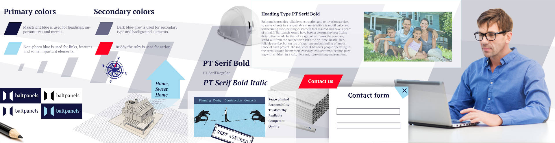
Colors
Where do you start with selecting colors for a project? The process is rather straightforward yet not without complications. The main ones being personal biases and the overwhelming desire to repeat what had worked before.
For this project we have researched local competition and explored key words that were discovered prior in our strategy workshop. Afterwards, a moodboard was created to set the mood (obviously) of the project.
Moodboard click to enlarge
The mood colors were closely examined and most prevalent were nominated as candidates for primary and secondary colors.
Mood colors
Primary colors:
Maastricht blue is used for headings, menus, important text.
Non-photo blue is used for links, features and some important elements.
Ruddy the Ruby red is used to draw users' attention to take action.
Secondary colors:
Dark blue-grey is used for secondary type and background elements
Typeface
The project required integration of three sets of characters: standard latin, latin with glyhps and cyrillics. The typeface had to accomodate all three languages consistently. Taking this into consideration, the PT Serif was chosen as the type family that can satisfy the requirements of this project. It consists of six styles: regular and bold weights with corresponding italics form a standard computer font family. The letterforms are distinguished by large x-height, modest stroke contrast, robust wedge-like serifs, and triangular terminals. Due to these features the face can be qualified as matched to modern trends of type design and of enhanced legibility. The fonts were developed and released by ParaType in 2010.
Logo
The more feedback we got from the company, more research we’d done on customers, the more crystallized our understanding of an image of the logo formed. Multiple mini doodles, sketches and drafts were drawn using high-tech modern tools like a sharp pencil and sheets of fine multi-purpose printer grade paper. This is by far the best equipment known to mankind when a boundless flow of creativity is anticipated.
Logo sketches click to enlarge
The form of a panel as an important logo element occured as obvious at first as it is represented in the name of the company - baltpanels, and was greeted sceptically and quickly dismissed in the beginning as being too obvious.
Looking into the matter thoroughly, playing with shapes and variations, we came to a conclusion on suitability of the form.
A panel usually has a rectangular shape. When looked at from an angle, it has a shape of parallelogram or trapezoid - the same shape a window, that you look through, or a painting hanging on a wall has.
It is what you see when you enter the room - walls opposite each other, a ceiling, a floor, a wall with a window or a door. These elements blend in with and create the environment for us.
Beautiful things you look at, into and through: paintings, mirrors, windows - all are usually rectangle-shaped. But it isn’t just the shape, it’s that they are (hu)man-made and are tightly knit into our habits, surroundings, emotions.
Numerous iterations with vector graphics helped refine the most promising options into digital drafts.
Digital logo drafts click to enlarge
Once the primary color was selected and key logo element justified, the main logo was finalized. At this point the shapes and colors have reason and meaning behind them.
Old logo
New logo
For smaller applications a simplified version of the logo was created. Color options and black&white variations generated as well.
Logo variations
We've made sure the logo looks good in multiple applications.
Messaging
Using the positioning statement developed in the strategy workshop, we focused on tranquil voice and forthcoming tone as benchmarks for generating brand messaging.
Take the first step. We will take care of the rest. Home, sweet home. Rest assured, you will have a peace of mind.
Visual element containing messaging example
Styleframe
In order to avoid countless website revisions, that consume tons of time and resource, we have invested into creating a styleframe.
What seems to be counter-intuitive at first, as making a piece of artwork takes time, pays off in the long run. It really helps to limit the variability, focus on the style, stay on the mutually agreed course, make changes in accord with the pattern. It is somewhat similar to a foundation stone of all the future projects.
Styleframe is a type of artwork that utilizes chosen primary and secondary colors, typeface, messaging samples, resources from moodboard and has additional design elements that highlight the overall style of the project.
It is a guide and a point of reference for any designer who will be working on designated projects. It is a visual representation of a brand guidebook, if you like, but more concise and subtle.
Website
Once the styleframe got approved, making a final version of the web app was a breeze. The design was thorough, thought-through and required little tweaks. All that we had left to do was to make it worked well and make sure it was responsive to a variety of interfaces: desktop, tablet and mobile.
Responsive website click to enlarge
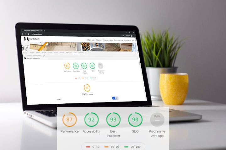
Website performance
It is good when a website looks nice, has some neat useful features, UI is interactive, it’s easy to navigate and key elements are easy to find. No doubt about that. But it is really frustrating when it takes too long for the web app to open/load, the front-end is encumbered with code that drains device resources making the browser reload and the battery juice stream towards zero.
We have implemented the best web practices at the time to make the website super fast and reliable. The audit from one of the key online search industry players (Google) showed our rankings were well over the average.
Performance audit click to enlarge
In conclusion
It was a wonderful, rewarding experience discovering nuances about the company, the industry and clients.
By following the process outlined in the strategy workshop we were able to signifficantly reduce the volume of time consuming revisions and redesigns. Together we had spent time figuring out who we were building for, what were we building and why. This approach aided in streamlining the whole endeavor and ensured consistent, considered design where every element created was inline with the goal.