Companies are reluctant to invest in their websites because they don’t see any value. Why bother investing resources into something that barely anyone will ever use?
A typical comment from a business owner goes like this: “Let’s make a website for free with any of those advertised web builders and get this over with real quick. Why hire anyone? These websites must be free anyway. I’m already paying for hosting.”
I thought, perhaps, due to the COVID pandemic, this is the perfect time to revisit the old ways of looking at this issue.
The New Office
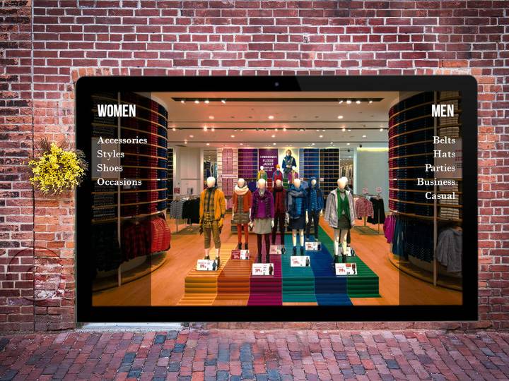
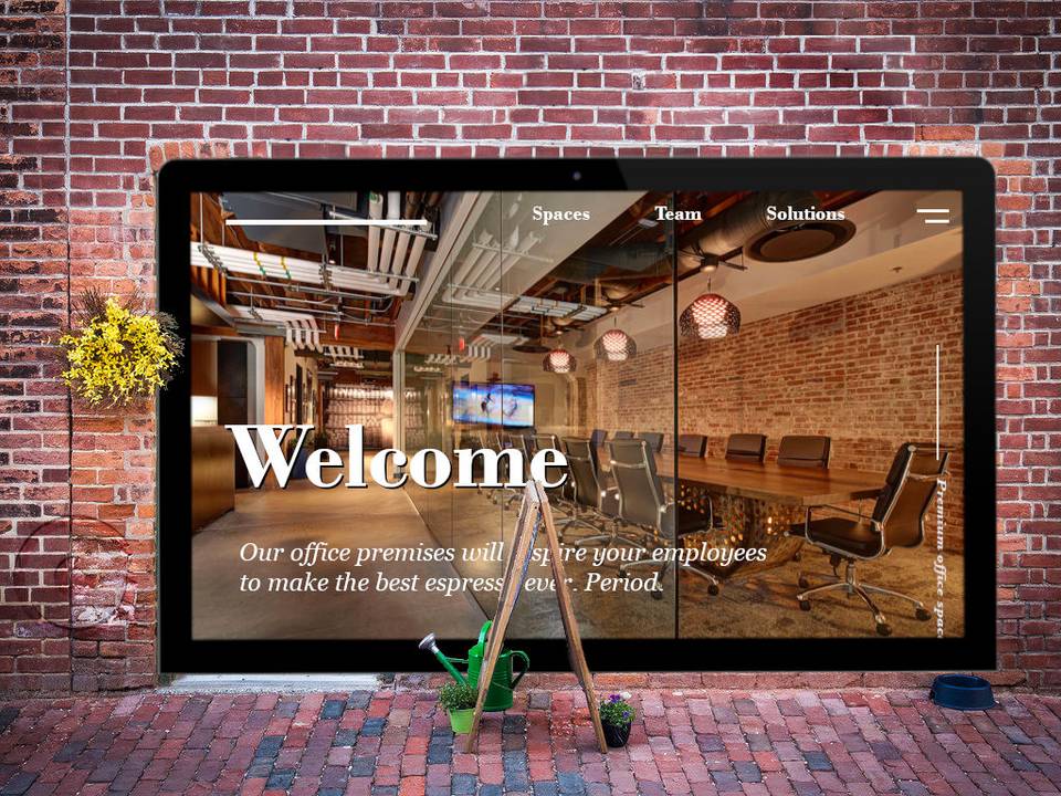
Here is my argument — I believe the business website isn’t that much different from the commercial premises — it serves the same purpose as any store, workshop, warehouse or office.
Any commercial brick & mortar space could be split into three areas, roughly speaking. First, there is an office space for employees. Second, there is a customer/client area for business transactions and meetings. Third, there is an area for storing goods and supplies. Let’s compare these areas with the website for the sake of the argument.
Office space
This is the area where employees run the business. They are interested in getting the job done with the least amount of suffering involved while the employers are looking to maximize the return on the salary.
Most of the astute leaders, fortunately enough, keep investing resources into ergonomic furniture, robust tools and reliable coffee machines — anything that could make people feel better today, excited to get back tomorrow and be as productive as ever in the nearest future.
A prudent business manager would replace squeaky, splotched swivel chairs with comfy leather ones, procure ergonomic desks and put some free espresso machines. These tools are not considered to be an expense but rather an investment. Taking care of your employees always goes a long way and no one seems to argue that this is not important. The value of investing into the office area is self-evident.
It isn’t the case with most websites however. Somehow they don’t get as much attention.
If you think about it, the web application serves the same purpose as the office space — to get the most productivity out of an employee unit by making the daily challenges easier to cope with. All the repetitive, mundane tasks could be automated with custom-made digital tools, allowing employees to focus on more important objectives, yet so many business managers fail to see this immense source of opportunity. Thus, the chair gets an upgrade while the website is neglected.

Client / Customer Area
Getting new clients and making sales is crucial to have a sustainable business. The allocation of resources towards pleasant atmosphere, positive first impression, the overall look and feel is a no-brainer and always gets a high priority in the budget list.
Well-lit rooms, comfortable chairs, short waiting times and a cup of fresh-ground coffee are among those things that management don’t argue over; a pleasant experience is important — no doubt about that.
But most websites aren’t enjoyable, in fact, they are dreadful: slow, cluttered and buggy. Home pages — the storefront of any business — look shoddy as if the construction crew had decided to quit halfway through the project.
Even though the purpose of any website is exactly the same as it is with the brick & mortar space — to create a good first impression and make the interactions pleasurable — many companies fail to deliver. Unfortunately, few business leaders acknowledge the necessity of improving the website experience as a priority.

Storage room
Almost every company has either a storage room with supplies or a warehouse with goods. The larger the company gets, the more challenging it becomes to maintain these premises and insure efficient logistics. The same is true for the digital content which nowadays is spread thin across a multitude of services and apps.
Today employees have to suffer through dozens of login credentials, stacks of browser tabs and steep learning curves of various third-party vendor interfaces. It takes a lot of productive time off and adds to the frustration.
The web application can provide a perfect user interface to get access to files, images, videos, documents, spreadsheets, reports, data sheets, revisions or comments — all in one place. Basically any digital content no matter where it is located or which third party application it is maintained by could be integrated into a custom-made storage system.
Through the power of API, all of the data stored across multiple applications can be integrated into the central hub which is your business website.
What’s the website supposed to do?
- Just like the office space where employees are supposed to have tools that make them more productive, the business website should be that toolbox as well.
- Just like the shelves, lighting, atmosphere and service in the stores improve the overall buying experience for shoppers, the website must be tailored to enhance the user experience of the visitors.
- And just like the investment in storage facilities and equipment makes daily operations more efficient, the tools for managing company’s digital assets have to be created.
The Real Problem
Having analyzed this issue for quite a while now, I have come to a conclusion that the real problem is in the vicious circle of utility. We are OK with paying for items used on a regular basis: a desk, a chair or a phone; and we hate paying for things we don’t use. The less we use something, the less likely we are going to maintain our emotional attachment. Thus, we value it less.
It is no wonder why we don’t feel like paying for a website — we think no one is going to use it. But it is exactly the consequence of not using the website to even a fraction of its potential that devalues it.
I don’t encourage you to visit our website because it isn’t great. And there is no point in making it great because no one comes to visit it.
The web app doesn’t have any visitors because the management hadn’t provided any reasons for people to pay it a visit. The home page is outdated and cluttered — so nobody comes. “We don’t have anyone on our website,” the management might say, “so why bother redesigning it?” And now no one will ever return.
If I were to take my manager’s hat off and step into customer’s shoes, I would probably ask this question: “When the whole experience of doing business with the company is terribly painful and miserable, why would I ever want to come back?”
The employees, on the other hand, don’t use the website because there is nothing built into it to help them become more productive. “None of the employees use our website, so why bother making anything for them?” the management says. And now no employee will ever think of using the website.
Another part of the problem is of “me too” type. When every competitor is posting ads in yellow pages it feels like you “gotta have an ad there too” even though every single issue ends up in a garbage bin or (best case scenario) serves as a doorstop. When major competitors’ websites look trashy most of the time business leaders think — it’s OK for my website to be crappy too.
What could be the solution?
Breaking away from this spiraling-towards-the-oblivion cycle is really simple and that’s why it is so hard. One has to acknowledge own shortcomings and admit the negligence of such a powerful tool — their own website.
It gets easier from there:
- Define your business goals;
- Prioritize the objectives;
- Consider our Website Worth Making package.
When you don’t need to invest in your website?
A. When you don’t care about your employees, their emotional well-being and productivity. “I know the swivel chair squeaks — so what? It’s good for building their characters — knowing what suffering is.”
B. When you couldn’t care less for your stakeholders’ expectations. “We are the best because we are the cheapest around here. So suck it up.”
C. When you’re going out of business because of A & B.
Not having a website do what it is supposed to do is like coming to an archery competition without the bow. Yes, you might be spectacular at tossing javelins, but in comparison to other competitors you’d be a laughing stock.

The impact of COVID
In the event the C-19 does not go away or a similar pandemic envelopes the world, the probability of ongoing lockdowns is going to increase; people will have to stay away from offices, stores, restaurants and workshops for extended periods of time.
The time is ripe for building a robust digital office.
Conclusion
A company website is a space for stakeholders to engage in business activities, to do the work they do and to reach the goals they’d set. Just like at the physical premises. A company website can become the ultimate tool for your business. Perhaps this is exactly the right time to look forward into the future and start building your new digital office today.
I feel excited to know that there are prudent business managers, entrepreneurs and executives who understand the inevitability of going digital. My hope is that now you are aware of the potential solution that is right there — under your domain name.
It would be wise to start exploring the immense potential hidden within your business website. Join us as we move onward discovering new web horizons. And when you feel like talking about it, contact me.
P.S.: This is not a crusade against leather chairs — I am fond of them myself and would love to get a really nice one someday.

