This page hasn’t been updated in a long time. We have changed our positioning and service offerings. Please get back to the main page to know more about our marketing solutions for professional services firms.
case study
The project
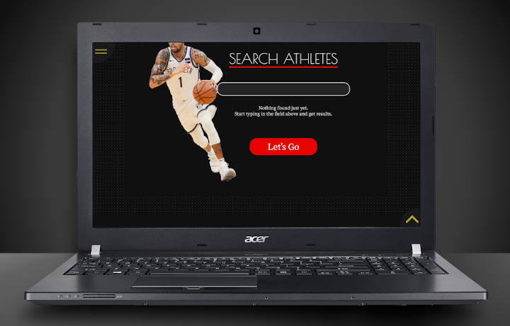
Develop a mobile friendly web app with a database pre-filled with entries of celebrities, actors, athletes, comedians, etc.; improve the offer form submission process and lead quality; create a simple logo and identity system.
The challenge
It was estimated that in order to reach the desired amount of database entries, it would require to have at least ten thousand profiles in it. These where not available for immediate upload - the data was not even there in any format. We had to come up with a way to gather the necessary info and populate the database automatically, as manual input would've taken (two minutes times ten thousand entries equals) three months for one person to accomplish this.
Commiting operators to handle incoming inquiries was out of the question - most of the entering requests coming from a regular booking form turn out to be cold leads. A robust easy-to-use screening/filtering system was required to ensure the quality of incoming leads.
Key words
We have explored key words that are relevant to the entertainment industry and hand-picked the most suitable for this project: private event, vip party, night club, fire & light show, champagne, black limo, red carpet, fancy dress, exclusive event.
All of these suggest a special occasion, thus - a potential booking contract for a musician, celebrity or a comedian.
Colors
With key words selected, we got into researching the industry and competition for visual references of the outlined subjects. To narrow down on options for the looks of any project, we develop moodboards that would define or, rather, hint or guide, perhaps, towards a certain frame of mind or a feeling about the project.
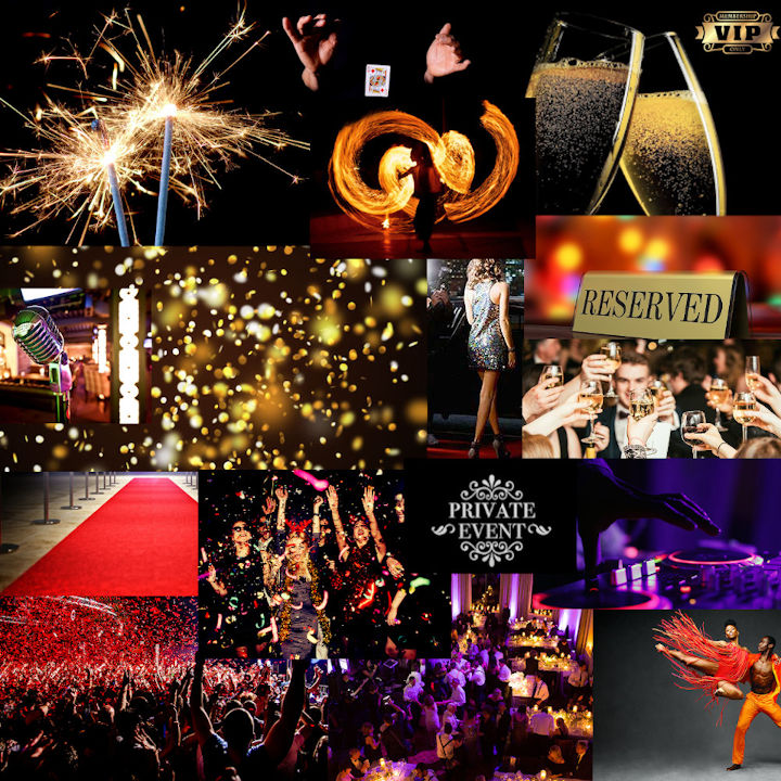
Using created moodboard, we extract predominant colors. We then investigate which combinations would work best and nominate colors as primary and secondary for the project.
Although in this case we had some interesting options with black-blue-yellow color combination, we had decided to go with a black-red-and-gold alternative as it had more of an incline towards a special, rare, valuable (gold) occasion with a twist of warmth and energy (red).
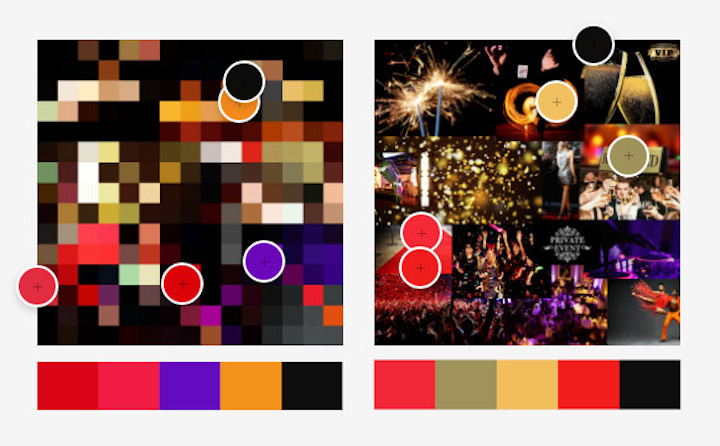
Primary colors:
Licorice black is used as a main background color.
Pure white is used for most text and menus.
KU Crimson is used whenever an action needs to be taken and to draw user's attention.
Gold metallic is used on clickable elements and some navigation.
Secondary colors:
Raisin black is used for secondary elements, e.g. background for certain navigation elements.
Chamoisee is used as a variation of metallic gold on certain elements like menus to add an extra detail.
Shapes
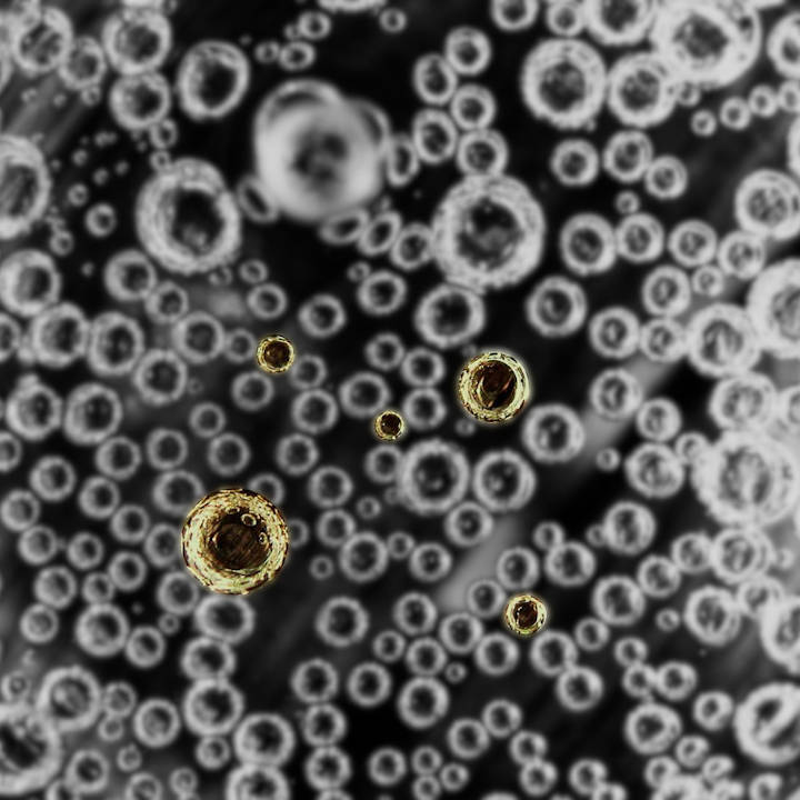
As the naming - starpleks - suggests, it has something to do with either celebrities or stars in the universe. Thinking of distant stars in a galaxy far far away and of celebrities, vip parties and private events we couldn’t help but imagine burning spheres and ice cold champagne with marvelous mesmerizing golden bubbles streaming upward. We've decided to use circular, rounded shapes that resemble these elements throughout the design.
Typeface
Keeping the selected shapes in mind we decided to use Poiret One as the main typeface for the project. It’s a fresh decorative geometric grotesque type with a hint of Art Deco and constructivism, unique with light forms and elegance, sleek and simple. Based on geometric forms, it has stylish lines and graceful curves.
This type really works well with the project’s selected ”spherishness”
as many of the characters contain geometric circles: o, p, b, a.
Logo
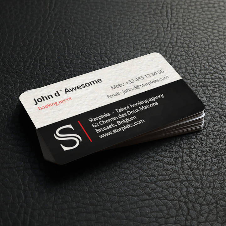
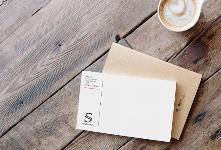
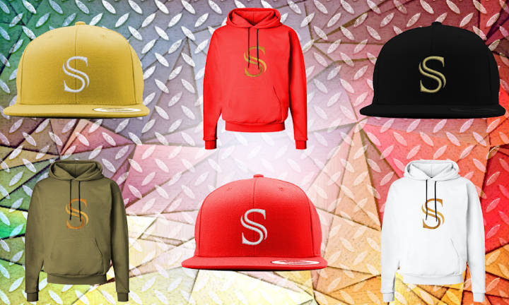
The project required a simple, clean, easy to memorize logo that would look good on merchandise like t-shirts, caps, hoodies, etc., and also work well with print assets, e.g. invoices, offers.
We've chosen to adopt an S letter from a serif type family with a prominent gap in the middle.

We've created different options for logo implementation - golden version for merchandise and black&white for business correspondence, and made sure it looked good in every application.
Styleframe
In order to avoid countless website revisions, that consume tons of time and resource, we have invested into creating a styleframe.
What seems to be counter-intuitive at first, as making a piece of artwork takes time, pays off in the long run. It really helps to limit the variability, focus on the style, stay on the mutually agreed course, make changes in accord with the pattern. It is somewhat similar to a foundation stone of all the future projects.
Styleframe is a type of artwork that utilizes chosen primary and secondary colors, typeface, messaging samples, resources from moodboard and has additional design elements that highlight the overall style of the project.
It is a guide and a point of reference for any designer who will be working on designated projects. It is an extension of what a brand guidebook might contain, but more concise, subtle and with real project focused examples.

Sitemap
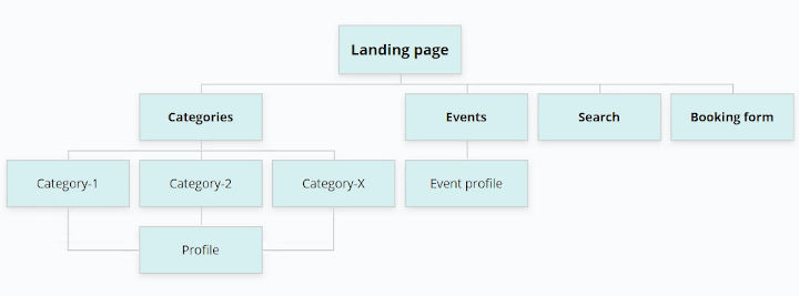
Prior to development of any web app (an exception is a one-page website) a thorough analysis of the structure and a sitemap as a result are required. This helps with figuring out the number of pages a project will have and their hierarchy.
Wireframes
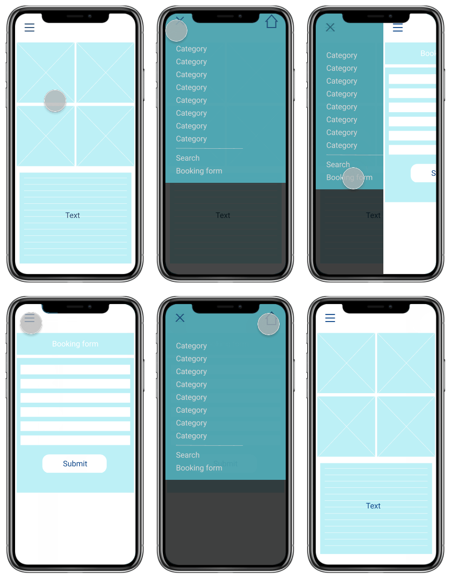
Once the sitemap is approved, we move forward with wireframes that are an approximation of layouts, relationships and functionality of the future web app. The idea here is to avoid making pages that would be deemed unnecessary and abandonded later and also test how easy it is, if at all, for a user to achieve their goals on the website.
Wireframes
Database
As it was mentioned in the challenge, there was no available database (DB) that could be uploaded and adjusted to fit the needs of the project, rather, we had to come up with an efficient way to generate the data on celebrities, athletes, actors, musicians, speakers and comedians using certain filtering criteria and populating specific DB columns with values such as stage name, category, website, twitter, facebook, instagram, country, etc.
We've devised and executed a special web crawler that generated 14 316 entries. Some of them turned out to be duplicates. After adjustments we've accumulated a little over 11 thousand unique profiles.
Leads
The means of making an inquiry about, e.g., a speaker is either via a phone call or by submitting a booking form.
The task was to make the form’s submission process as user-friendly as humanly possible while simultaneously shifting focus towards an online inquiry and improving the quality of leads.
To achieve this we’d placed a phone number at the bottom, in the footer area and did not make it stand out in any way.
The call to action buttons that enabled the booking form were made with high contrast and a lot of negative space to help them stand out.
We’d made the traditional booking form available via the top navigation menu on every page of the app. Then we’d generated another - unconventional form accessable in every profile with a prominent book now button.
The way a user would interact with this second form was similar to any messenger or chat. There were series of questions a user had to provide answers to and some multiple choice questions as well.
We’d kept both forms and implemented a tracking system to measure which of the two had been preferred by users. Turned out, not only did the second chat-like form had been utilised twice as much, but it also provided more insights into the potential lead, as users were texting more info than what’d been asked for.
To ensure a certain level of quality of the leads, we’d included several extra questions like a budget for the event and made them compulsory to guarantee only serious inquiries get through.
Website
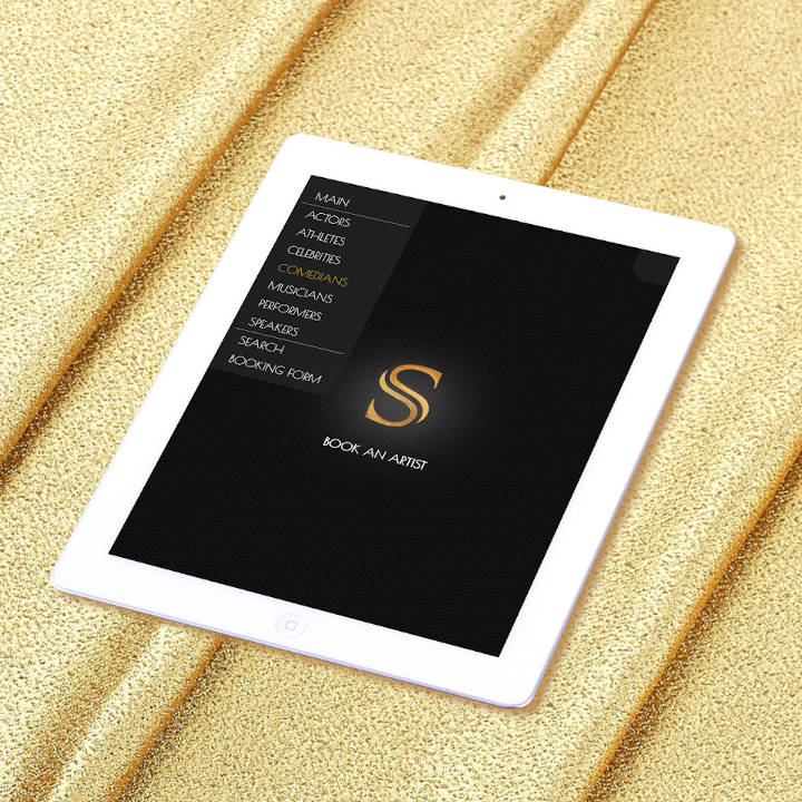
When sitemap, styleframe and wireframes are confirmed, the work on the actual web app can proceed at a much faster pace and with less, minor tweeks further down the line. Most of the development time hasn’t been spent on the actual development and deployment but rather on testing to make sure the website is responsive, works well, loads fast and is consistent across all targeted devices: mobile, tablet and desktop.
in conclusion
This was a challenging and therefore really exciting project to be working on. We were faced with demanding business problems and once again were able to come up with unconventional solutions. Kudos and big fuzzy hugs to us!
