This page hasn’t been updated in a long time. We have changed our positioning and service offerings. Please get back to the main page to know more about our marketing solutions for professional services firms.
case study
The project
Create a logo, a business card and a website that would represent and reinforce the key product - collectible cards as a brand loyalty solution.
The challenge
Collectible cards aren’t the only brand loyalty solution out there and transferring the exact cards' design into the website or a business card didn’t seem like a good idea. Besides, the cards are always customized and their looks aren’t consistent from project to project.
Our designs had to be more versatile yet akin to the theme of board games and playing cards.
About
Loayalcamp teamed-up with one of the world's largest playing card and board game manufacturers offering brand loyalty services to large retailers.
The problem
Whenever a low-margin, high-turnover market reaches saturation - competitors open stores next door, start price wars and target the same client - the time for customer loyalty is, well ... was yesterday.
Loyalcamp offered unique campaigns that helped in fostering engagement, increase the average cheque and encourage customer returns. The solution involved collectible themed cards and fast-paced addictive board games that were presented to clients whenever a specific spending threshold had been passed.
Customers
Companies that would be interested, able to afford and benefit from this type of brand loyalty campaign are large chains, e.g. supermarkets, grocery stores, consumer electronics, fast-food restaurants.
At some point we realized that the prospect client who is going to be considering the offer would be asking this question. Will this particular company (Loyalcamp) be able to ensure an engaging, memorable campaign to our customers and meet our success criteria?
So our job was to make sure we're targeting the customers of the customer, in this case - families with children, and reflecting this in the overall design of the project.
Positioning
Loyalcamp creates and organises unforgettable brand loyalty campaigns to consumer-centric companies in a creative environment with an energetic voice and enthusiastic tone, helping clients be prosperous and feel invigorated.
The most suitable archetype Loyalcamp fits into is a Creator interested in innovation while utilizing creativity and imagination to make every campaign unique and unconventional.
Destination
Brand loyalty campaigns have been around for a while. There are plenty of options, yet they all seem to be quite similar - collect stickers to purchase an overpriced pan with a discount.
Loyalcamp believed they had something different to offer and wanted to keep focus on their key competitive advantage - unique custom-made collectible trading cards with board games.
Colors
Selecting color combinations for any design project has always been challenging for every designer or artist - there's just too many options to choose from. That’s why our strategy sessions are so crucial - it is really helpfull to have a conversation, discover and pick the words that are most suitable for describing the company, customers, feelings and so on.
Once key words are selected, we move forward looking for the visual representation of these words - images and photos that best describe not only the words themselves, bet their composition as well.
Having a substantial amount and variability of these images we create a moodboard that is there to help set a frame of mind, invoke an emotion or, perhaps, a blend of feelings towards the subject.
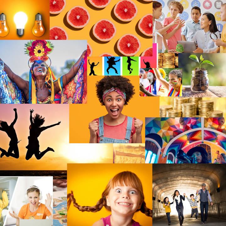
To avoid additional influence some personal preferences might bring during the process of color selection, we extract the most abundant colors by breaking the image into large squares. Now we only have 100 colors to choose from (instead of infinty). Some of them are more frequent like orange in this case.
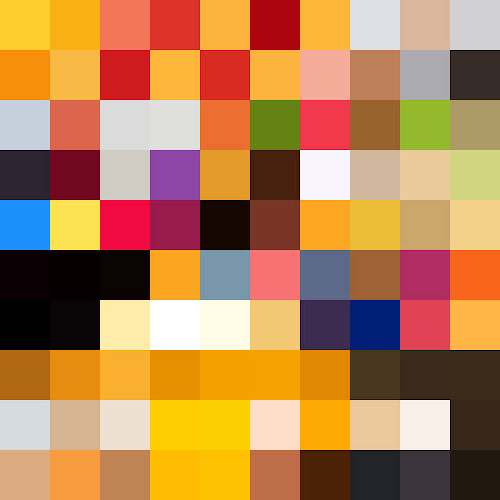
In order to select primary and secondary project colors we have to check each of the most prevalent ones for compatibility, contrast, as well as their tints, shades and tones.
Here are the colors that we've chosen for this project.
Primary colors:
Maximum red is used for clickable elements and important backgrounds.
Ryb blue is used for links and actions.
Munsell yellow is used in actionable elements and some important backgrounds.
Secondary colors:
Smoky black is used for most type elements: both headings and body text.
Lace is used mostly for backgrounds and some text where appropriate contrast is required.
Tennesse orange is used for background elements.
Typeface
For this project we were looking for an energetic type. We did not want it to look too comic-like or childish. That was also one of the reasons why we’d ditched speech bubbles in our artworks. And so a combination of Exo 2 and Source Sans Pro were chosen. The former was meant for headings, the latter - for body text.
We have to admit of using a third type - Badaboom, but very modestly, just a teeny-tiny smidge, to spice things up just a bit. Guilty. But it looks... OK?

Logo
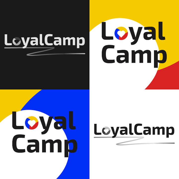
The idea of making a circle composed of three equal colorful parts with a heart shape carved out in the middle came with an understanding who the target customers were. The hues of blue, red and yellow are not rarely implemented in the FMCG sector. Blue and yellow are often used by consumer electronics companies, red and yellow combinations are utilized by many restaurants and grocery stores.

Three equal shapes also represent three major pillars, three promises Loyalcamp makes and values most:
customer engagement - making unique campaigns so exciting that customers can’t wait to share the news of their envolvement with others;
average check increase - making sure client gets a tangible ROI;
churn reduction / return customers - making campaigns enticing and rewarding to participate multiple times.
The shape of the heart is a symbol associated with love, but in our case it has to do more with caring about the consumer - the end customer who shops at companies' locations. The heart depicts mindfulness of one's well-being. The message here is that Loyalcamp takes clients' end customers' well-being and interests to heart and, as a result, transfers and implements this mind set in every brand loyalty campaign.

We’d explored multiple options for the main logo that would incorporate the icon. Some of those looked really ugly, but, hey, that’s why we do it - generate as much options as we possibly can and then pick the ones that slipped through our sieves of scrutiny.
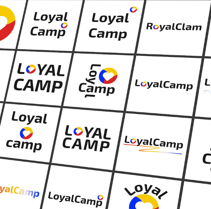
After analyzing a dozen of good-looking alternatives, we’d decided to nominate this artwork for the main logo title. Why? Well, it just looked better than others did.

We had also made black and white variants and several options for social media icons.
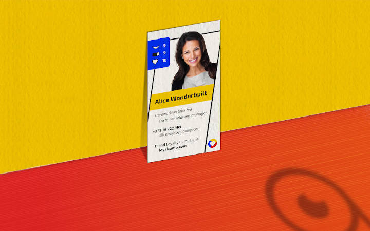
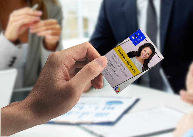
Business cards had to stand out (of course) - but not be pretentious, memorable - but not flashy, have resemblance to the theme of cards and board games - but not to be confused with such and comprehended as a business card (BC). We were looking for a unique style.
It is a rare case when a BC has a photo of the person on it, yet we felt like this is the right way to go. We made the area of the photo prominent, surrounded it with comic-style features like dotted background and an energetic (therefore skewed) frame. The most important parts of the BC were emphasized with bold font (e.g., phone number) and color like the name on the yellow background.
We had also added a stats feature as if the owner of the BC had superpowers. Pretty sweet!
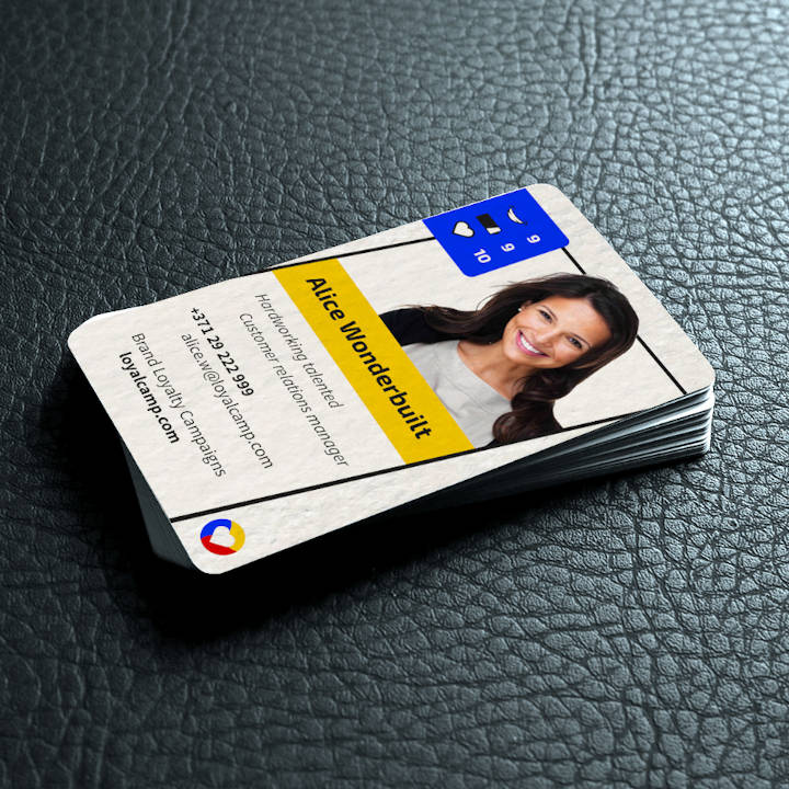
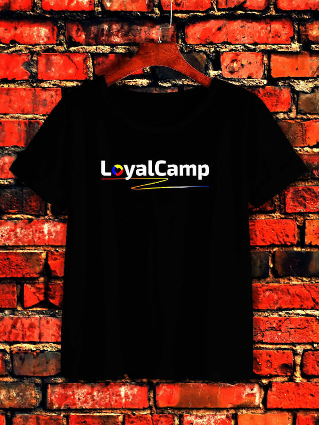
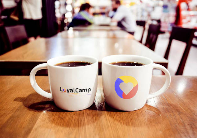
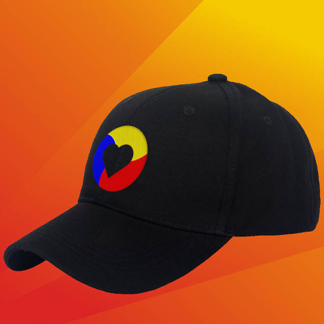
To make sure our logo designs work well in real life conditions and not only in our delusional fantasies we had to ensure our logo variations look awesome across multitude of applications like merchandise, stationary and print.
Styleframe
Before we would indulge ourselves with sinking our hasty fingertips into restless keyboards and start coding the night away what would possible become the next best-website-ever, we had to make sure we were on the same page as regards to colors, shapes, forms, design elements and overall mood. Is there a better way than combining and showcasing it all together in one big slice which is the styleframe? Who knows? (This one's rhetorical.)
Until that remained to be determined, we’d created the styleframe based on the task at hand, explored colors, type and moodboard. The style had to radiate enthusiasm and energy.

Sitemap
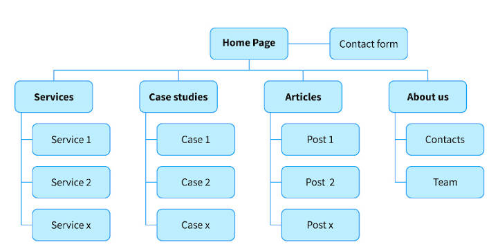
With styleframe approved we move forward one step closer to coding a web app. First thing's first, however. To determine how much work needs to be done we start off by generating a site map for the future website. This helps figuring out how many unique page designs there will be and their hierarchy.
Wireframes
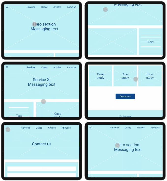
Turns out - wiframes are great for planning user experience. They allow us to create a simple yet effective visual representation of position of specific elements and their relationships. It’s also a great way to test the complexity of reaching goals the user would have on the website.
Website
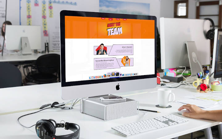
Having done all those what at first seemed like extra steps - styleframe, sitemap, wireframes, we were actually able to save tons of time and resource during the development phase. There was just no need for major changes as everything had been discussed, evaluated and approved.
In addition, design elements present in styleframe can easily transition into any other type of marketing effort maintaining a seamless, consistent look across different platforms and assets. Time and resources spent well indeed!
In conclusion
Working on such a wonderful project got us all contaminated with enthusiasm and vibrant energy.
Our strategy workshop helped with identifying target customers, discovering how the offer is best described and formulating that in a concise manner.
We've created a logo and several logo variations, selected primary and secondary colors and type that match the overall mood and are coherent with goals of the project, designed memorable business cards and developed a well-thought-through website that brings in and ties all these artwork pieces together very nicely.
